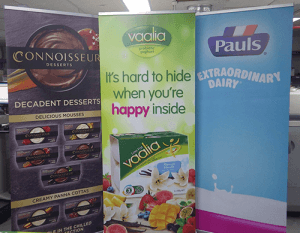
A pull-up banner is a cost-effective and versatile promotional tool and a great way to catch the eye of customers and prospects. But it needs to include the right design and information if it is going to make an impact.
Check out these design tips to help your pull up banner stand out every time.
3 Tips on how to Design an Effective Pull-Up Banner
1. Design for Eye Level
Remember that people read from top to bottom. So anything that you want to grab their attention should be placed at eye level. Use the top of your pull-up banner to display your company logo and most important message (e.g. promotional slogan product image etc.). Choose a decent font size so that words jump out at people from a distance or as they walk by and keep things simple and to the point. You can always provide more detail in other marketing material such as brochures and flyers.
2. Make Great Use of Colour
Colours used in your pull up banner design should complement your brand and logo. Think about the impact of your choice of background colour on the text and images you need to include. Everything has to be easy for your audience to take in at a glance. Avoid yellow and white together as it can make information difficult to take in especially from a distance. Bright colours like red and orange can really capture attention and achieve the desired effect.
3. Use Quality Images
Images displayed on your pull up banner need to be of the highest quality (particularly if you want to feature product images). As a guide – images should be saved as CMYK and no less than 300dpi. Never save images straight from a website for your pull-up banner as they won’t be saved in the right format or be high enough quality. If you don’t have suitable images or the budget for a photo shoot, your graphic designer can help source royalty free stock images.
For an eye-catching, effective pull-up banner or large format piece that gets your business noticed, speak to your local Kwik Kopy today.


