 Colour theory is all about how colour works. Understanding colour theory can help improve your design eye and make sure you choose the right colours for your branding and promotions every time.
Here are three areas to pay particular attention to…
3 Tips for Understanding Colour Theory
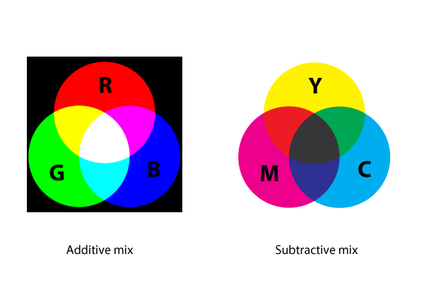
1. Learn About Additive and Subtractive Mixing
There are two ways to go about creating the colour – either by mixing light (additive) or by mixing paint on paper (subtractive). Additive mixing is all about combining red, green and blue light sources in various intensities. So the more light you add the brighter your colour mix becomes – which is the way we are used to mixing colours through the RGB computer model.
But before TVs and computer monitors, printers and publishers were using subtractive colour mixing which was the norm. This is where you subtract light from the paper by adding more colour. Originally, it was just red, yellow and blue used in the subtractive process but as printing emerged, these were replaced with cyan, magenta, yellow and black (CMYK) enabling printers to produce a larger variety of colours on paper.
2. Understand the Gamut
A colour gamut is a subset of colours, such as those in a specific colour space. Every device and printing process (e.g. colour printer, camera, scanner, monitor etc) has its own set of colours that it can successfully reproduce. A colour gamut is used to make these differences clear as well as show what colours they all have in common. As you can see, your colour options depend on what you’re working with. RGB screen will let you mix very bright and saturated colours, but if need to print your design then your options change due to the limited colour spectrum of a CMYK printer. Similarly, if you saw a brochure printed with vibrant pantone colours, you won’t find them on screen as they can’t be reproduced on RGB monitor.

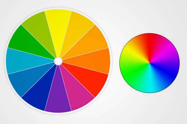
3. Know How to Read the Colour Wheel
The colour wheel is the best way to think about colour when it comes to creating effective design. It shows exactly how primary colours blend to create various hues.
- Primary colours: red, yellow and blue
- Secondary colours: green, orange and purple hues created by mixing primary colours
- Tertiary colours: further colour hues achieved by mixing a primary colour with a secondary one. They are usually named with two words, such as blue-green, red-violet and yellow-orange.
Grasping how colours relate to each other also gives you a sense of what works – known as colour wheel harmonies. The colour wheel lets us see at a glance which colours go together, using colours harmony rules such as the following relationships.
- Complementary: opposite each other on the wheel
- Analogous: adjacent to each other on the wheel
- Triadic: 3 colours positioned at 120 degrees on the wheel from each other
By using one of these colour harmony combinations, you will achieve a design that looks balanced and pleasing to the eye.
To get the colours of your branding and promotions just right, speak to the team at your local Kwik Kopy today.
Image source: http://99designs.com/designer-blog/2012/08/29/the-7-step-guide-to-understanding-color-theory/