What do McDonalds and Coca-Cola have in common besides food ingredients? Well they both rank in the top five iconic brand logos in the world. They’ve not only lasted the distance, they’ve also been permanently etched into our national psyche.
The vibrant golden arches of McDonalds and the simple cursive script of Coca-Cola prove the importance of designing quality, well thought out logos right from the beginning. Creating logos with longevity requires ongoing refinements to ensure their relevance in a modern age. Let’s take a look at the evolution of the top five most iconic logos.
1. WWF (World Wildlife Fund)
![]()
The WWF black and white panda has become an icon not just for WWF, but for the conservation movement as a whole. The panda was designed in 1961, inspired by Chi-Chi, a giant panda who had arrived at the London Zoo. It has undergone three transformations to become what it is today. Despite its evolutions, it has remained identifiably consistent over time. The logo has the “cute” appeal working in its favour using the black and white panda image, with appealing black patched eyes. At the same time, it is a strong and recognisable symbol that breaks language barriers and effectively communicates to the world the values of the World Wildlife Funds message of preserving the environment, all endangered species and their habitat. (Image from WWF)
2. McDonalds
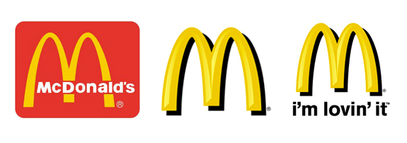
The “Golden Arches” are an easy identifier of the McDonalds brand. It is arguably, one of the best recognised brands in the world. The arches and colours have stayed consistent, with different slogans in different places (middle, below) over the years. The logo is distinctive, memorable, and simple in design. The colours used (red and golden-yellow), represent boldness and power, and are also known to evoke hunger according to colour psychology. (Image from thelogomix.com)
3. Coca-Cola
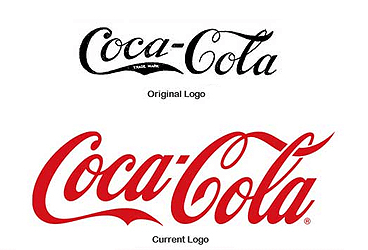
The Coca-Cola logo is an excellent example of one that is timeless in design. This logo is one of the most recognised in the world with consistent guidelines around its use. Originally designed in 1886, the basic Coca-Cola logo has persevered for the past 127 years unchanged. While this logo uses a fancier font than the others, it still manages to maintain simplicity, with the contrast and boldness of its red and white making it instantly recognisable. (Image from famouslogos.us)
4. Apple
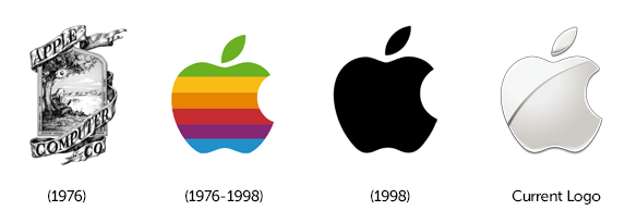
This famous icon is not the first logo designed for Apple. The first design was in fact a detailed drawing of Isaac Newton sitting under an apple tree, the complexity of which Steve Jobs blamed for the initial slow sale of Apple computers. This led to the design of the logo we all now know and love, created by Rob Janoff. Again, the Apple logo is very simple, yet memorable and identifiable. It works well in colour, monochrome or with a gradient (as it is often seen). While it has changed over the years to keep up-to-date and stay modern, the basic silhouette has remained the same unforgettable icon to this day. (Image from Conduit)
5. Nike
![]()
The ‘swoosh’ in the Nike logo is unrelated to the company’s product and purpose. However, it is instantly recognisable and versatile. It follows the general rules of simplicity and has become an urban style icon across the globe. The one dimensional image works well in any colour, which the brand has taken advantage of. Since 1971, the word ‘Nike’ has been included and excluded, the font has changed, but the ‘swoosh’ has remained consistent and a favourite worldwide. (Image from thelogomix.com)