
 When it comes to effective design, the saying less is more speaks volumes. In this case, the ‘less’ we refer to is ‘white space’ – the space between words and pictures – an important design element that delivers maximum impact.
White space has the power to direct your target market to look at whatever you want them to or to reinforce your branding. It can be used to improve readability and is particularly effective for minimalist designs or to portray a professional image.
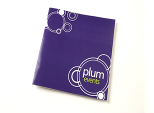
Now we should clarify that the space doesn’t need to be white – for example, on the Plum Events brochure cover to the right, the white space is actually purple.
There are two types of white spaces in design:
- Active – where the space is left intentionally blank to create better structure and layout. It also emphasises the content area, leading the reader from one element to another
- Passive – where the empty space is around the outside of the page or blank areas inside the content (a by-product of the layout process)
3 Reasons to Use White Space in Your Designs
1. White space creates focus and balance
When you use white space to surround something – then that something really stands out allowing you to really focus on what is being advertised. Space also creates a balance and without it your design or text will seem busy on the eyes. Adding the right amount of white space in the right pages can make your design seem balanced and attractive in order to appeal to your target audience.
![]()
2. White space improves readability
It’s important that designers are aware of the influence of white space in reading performance (so its use can be particularly effective in brochures for example). Words that are easy to read will be read more often than words that aren’t – so there’s a definite advantage to making the most important words stand out. The example below shows the effective use of an image and words that are easy to read when they are surrounded by white space.

3. White space increases appeal and impact
White space can increase the overall visual appeal of your design. White space can also portray quality and professionalism. You will often find more minimalist designs in the luxury market. Advertisements of expensive and branded items often make use of white space. Most of the time, cosmetics use posters that have more white spaces to show that their products are of high quality and expensive. Quite often, cheaper products come in colourful packaging whilst more expensive ones use more minimal colour.
Note how the use of white space in this iPhone advertisement has been designed to appeal to its target audience and creates a professional and elegant look.
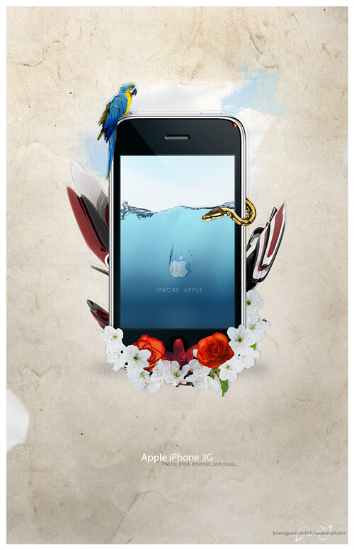
Image source: http://naldzgraphics.net/design-2/11-reasons-why-white-spaces-are-good-in-graphic-design/
To get the most out of design and print for your business, speak to the team at your local Kwik Kopy today.