 You already know that print and web design are two different mediums – but what you might not be aware of is just how the differences might affect your design.
There are a few things that you have to take into account when designing for each medium.
The Difference Between Print and Web Design
- File Size and Image Quality – The biggest variant between web design and print design is your file sizes and pixel count. If you’re designing for a website, all images need to be optimised for the web and 72dpi (dots per inch). Web optimised images will load more quickly and improve overall user experience. Alternatively, if your design is going to be printed, then you’ll need a higher quality image. To get a crystal clear image you’ll need your images to be 300dpi or above.
- Navigation and Interactivity – With print design you don’t have to worry so much about the usability of the navigation because the only thing your audience needs to figure out is how to turn the page. However, with web design you have many more elements to consider and you need to design something that will be intuitively usable and look great on all monitor sizes and devices.
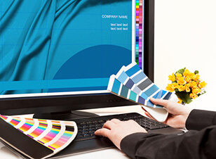
- Colours – When you’re designing for print – colours and transparencies can look completely different on the printed page than they did on your computer screen. To avoid this issue, it’s always best to use a Pantone Colour Picker and choose your colours that way. It also pays to remember that some colours – like really bright neon colours – aren’t able to be printed with traditional printers. Website design gives a lot more flexibility with colours, but you still need to take into account different monitor settings.
If you need help creating a great design for your print media or business website, the experts at Kwik Kopy are here to help. Contact your local centre today for a free design consultation.