 Just as the colour you choose for your business branding can communicate volumes to your customers, so too can your choice in font. Typography is a core part of a professional designer’s training. Before they choose a typeface or font, designers first consider the job the type needs to do.
Although the role of type is mostly to display words, the readability of type matters more when you have more words to communicate. Clear, simple typefaces are better for slogans and multiple sentences in brand material (such as a brochure).
Consider these two simple rules of typography:
Simple font = easy to read, hardly any effort required to scan and absorb the message (conversely this can make the words less memorable), visual message of the typeface is minimal, harder to associate with any particular brand.
Complex font = harder to read, message becomes more visual than textual (but the effort required can make the words more memorable), easier to associate with a brand if the typeface is unique to the brand.
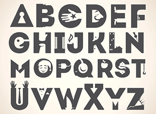
Some words of warning though: a small number of Words IN CAPITALS can be easy enough to read in a logo, magazine headline or sign, but you don’t want too many word shapes of the same size all in a row, because those letters will stop working together to form words and start to blur into an image. That said, artistic or more complex typefaces combine letters better to form a visually engaging shape, and illustrative fonts allow designers to choose more interesting shapes that help convey an impression or emotion.
Now consider some basic psychology about different typefaces.
There are two main types:
Serif (typefaces whose letters have hands, feet or tails at the top and bottom)
Sans serif (letters without serifs).
The general rule is that serif typefaces make each letter easier to distinguish, and therefore might help make comprehension easier. Yet most of our handwriting is sans serif and therefore some sans serif typefaces feel more personal. Regardless, serifs or sans, simpler typefaces are the way to go if you want people to read a lot of text.
The overall impression can also be influenced by using hard or soft lines. Rigid typefaces convey authority, solidness and reliability; curvy typefaces with more noticeable tails seem friendlier, intimate and emotionally appealing; and artistic typefaces, resembling drawing or calligraphy, help communicate creativity.
Bizarrely, some studies by neuroscientists and designers alike have shown that beautifully designed yet hard to read typefaces force us to make a bigger commitment to reading text, and somehow convince us that the effort is worth it. You’ll see examples of these exquisite typefaces on restaurant menus and fashion labels.
If you’re looking for advice on your brand identity, speak to Kwik Kopy to find out about our design services.
Looking for expert advice about creating or updating your brand identity? Speak to Kwik Kopy about professional print and design services to meet your business needs – locate your nearest Centre.