Choosing to use bright colours in your logo design is a bold move but when done well can create something truly memorable. There is nothing like a splash of colour to inspire and brighten your day, so let’s take a look at some of the great logo colour schemes that have captured people’s attention for all the right reasons.
4 Famous Logo Colour Schemes
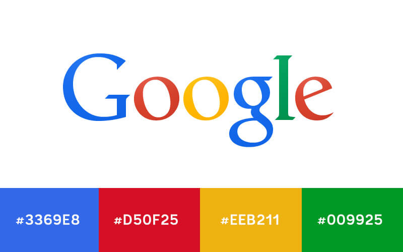
1. Google
When you think famous colourful logos, you really can’t go past Google who have created one of the most influential logos of our time. We particularly like how you see variants of these colours used in most of the Google doodles we all know and love. Interesting to note that they seem to give designers a little bit of freedom to explore each colour hue in the doodles they create rather than having to keep strictly to the colour palette.

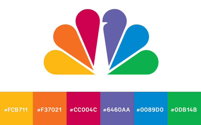
2. NBC
The U.S. broadcasting network has seen a lot of change in their logo since they launched in the 1920s. But in the 50s they opted for colour to reflect their colour television programming and the colour scheme has remained. The logo and its bright bold colours speak to the diversity of its target audience as well as its programming.
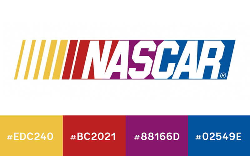
3. NASCAR
Fans of stock car racing will instantly recognise the well-established NASCAR logo which again uses multiple colours. Each of the colours featured in the logo has their own distinct break from the next. What is particularly interesting is that the slant of the graphic creates an even transition which blurs the colours together. The end result almost makes you feel like you’re at the race watching the cars whizzing by!
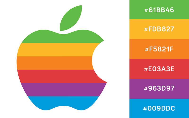
4. Apple
No discussion of famous colour logo schemes would be complete without this blast from the past – the Apple logo that we first caught sight of in the 1980s. The bold colour scheme grabbed everyone’s attention helping to build excitement and anticipation for the revolutionary product the company was promoting.