 Posters are an affordable and effective way to get your business noticed. So when it comes to creating the perfect poster for your next marketing event or promotion it’s important to strike the right balance between including the information you want to convey along with a design that appeals to your target audience.
Here are some design tips to help your business leverage its poster power…
Top 3 Poster Design Tips
1. Use Great Colour and Images
If you’re going to grab the attention of your audience, then eye-catching colour is going to get your poster noticed. But it’s not just about having visual appeal, it’s about having the right design that has audience appeal. Think about your branding and the colours people associate with your business. Choose colours that align well with your line of work and the demographic you want to attract. If using images on your poster, these must be high resolution to make an impact with your targets and the colours you use in your poster design should complement too.
2. Organise by Importance
Great poster design organises information in order from highest to lowest priority. Make sure that your most important text is at the top of your poster and in a larger font. Less important info should be in a smaller size font at the bottom. Remember, people may only glance at your poster and give it a few seconds of their attention so you need things to jump out at them. To get your message across quickly and effectively, try to keep your copy to a minimum and only include the really important things that people need to know.
3. Balance Design Elements
For your poster to flow well, you need to balance the composition. Imagine a line in the centre of your poster (both horizontal and vertical). Check that you have an equal amount of design elements on each side (text, images, white space etc.). You want everything to sit comfortably on the eye so that your audience wants to read it and this also means balancing your images and text. You want the image to be something people notice and if it grabs their attention, the rest of the information on your poster has to be easy to understand too.
Expert Tip
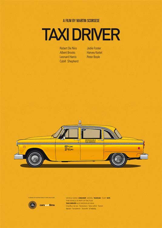
 Illustrator/designer, Jesús Prudencio (who designed the fantastic Cars and Films series of posters) says that behind every good poster should be a message or idea that communicates something and reaches everyone. He also stresses the importance of consistency when it comes to great design.
In the case of his Cars and Films project, for example, the most important aspect was the car. He chose the same font for the titles of all the series for consistency. He chose a contrasting font for the detailed info accompanying the car and then chose a background colour based on what he felt the film symbolised and what would combine well with other elements – as can be seen in this poster for the movie Taxi Driver.
For help designing great posters that get your business noticed, speak to the team at your local Kwik Kopy today.
Image source: http://www.creativebloq.com/print-design/how-design-poster-pro-tips-7133634