 When you start designing a business website, you might find yourself thinking about a whole range of things that you’ve never considered before. Such as which font to choose – or what shade of blue your background should be or – even more importantly – what colour should you choose for your buttons.
Now you’ve probably visited hundreds of thousands of websites in your life, but we think you may barely have noticed those little details. But just because you didn’t notice them, doesn’t mean they’re not important! Quite the contrary – in fact, all those tiny design decisions add up to a successful (or not so successful) website!
When it comes to button colour, there is no one right answer. We’re sorry to say that making all your buttons forest green, for example, isn’t going to magically convert more visitors. But finding the right colour for your user will, and luckily for us it’s something that is really simple to test out.
The Colour Test
It can be as simple as creating two copies of the same page, with one small difference and watching the visitor stats to find out which one performs better.
This kind of testing can seem fiddly and time consuming, but optimising your website and increasing conversion is one of the best things you can do for your business. You see – quite often a successful site really does come down to something as simple as the colour of your buttons.
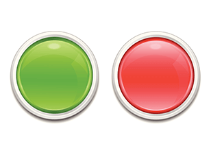
In fact, this company, HubSpot, saw a click increase of 21% just by changing one button on their site from green to red. Everything else on the site, from the font through to the graphics, was exactly the same – but 21% more people clicked the ‘get started now’ button when it was red.
If you’re not sure where to start on your business website, the team at Kwik Kopy can help! Contact your local Centre today to find out how.