Typography is extremely important when it comes to the design of your marketing collateral (both print and online). As well as being important for establishing your brand and identity, it can also help make information more interesting, provide clarity, project professionalism and add more appeal.
The role typography has to play when it comes to design can be misunderstood and if someone isn’t trained in how to handle and set type then it can be difficult to achieve the end result you’re hoping for. A bit of care and attention when it comes to setting type on a page can make sure that design and content captures the eye of the target audience.
Take a look at some of the more common typography mistakes made in design so that you can make sure you avoid them.
4 Typography Mistakes to Avoid
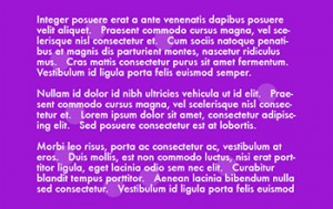
1. Centering Text
As a general rule, only ever centre text if there is a good reason to do so and it is going to significantly enhance your design. Don’t try to centre text to create a sense of balance in your design – but if you do require a solid block of copy then use justified text.
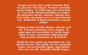
2. Two Spaces after a Full Stop
In the days of typewriters then a double-space after a full stop was used to avoid characters appearing too close to the stop. But these days, two spaces after punctuation is old-fashioned and something all copywriters should know – and avoid!
3. Excessive Positive Tracking
When we refer to tracking, we’re talking about the space between the letters across an entire word or phrase. Designers use tracking to alter type so that they can fit it perfectly into a particular line length. Small adjustments work well but too much tracking can reduce readability of your copy.
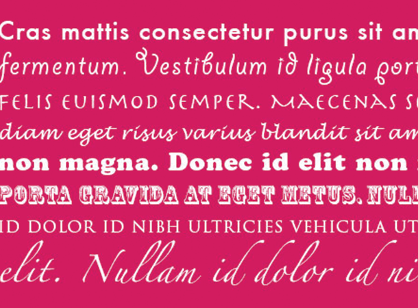
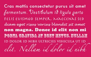
4. Too Many Faces and Weights
Using too many fonts and weights in a design can be a big mistake and make the overall appearance of your copy seem confusing and cluttered. Whilst using the same font with different weights can be okay if your design calls for this, as a general rule it’s best to stick to a maximum of three different fonts for each piece of work.
For great design that gets your business and brand noticed, speak to the team at your local Kwik Kopy today.
Image source: creativeblog.com