 Typography is the selection and arrangement of typefaces, sizes, and spacing on a printed page. A typeface selection can be critical to the impact of the printed word. It is an extremely important piece in the overall design process; but, with over 20,000 typefaces available and more being created every day, where do you begin?
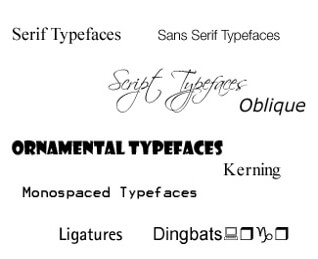
Serif Typefaces: Serifs are lines or curves projecting from the end of a letterform. Typefaces with these additional strokes are called serif typefaces. Serif fonts are generally used to achieve an elegant or classical look.
Sans Serif Typefaces: Sans serif typefaces do not have finishing strokes at the ends of the letterforms. The name comes from the French word sans, meaning ‘without’. Sans serif typefaces generally project a contemporary look.
Script Typefaces: Script typefaces simulate handwriting, with one letter connected to another visually, if not physically. Script typefaces emulate several different types of hand-lettering, including calligraphic, drafting, and cartoon.
Ornamental Typefaces: Ornamental typefaces (also known as novelty or display fonts) are used exclusively for decorative purposes, and are not suitable for body text. They have the most distinctive designs of all fonts, and may even incorporate pictures of objects or animals into the letter designs.
Monospaced Typefaces: Monospaced typefaces are those where every letter is the same width. The first monospaced typefaces were designed for typewriters, which could only move the same distance forward with each letter typed.
Oblique: An obliqued character or word is one that has had a slope applied (by the computer and usually between 9% and 11%) to its Roman to effect a simulated italics. True Italics are not simply sloped Romans, but are specifically designed characters.
Kerning: Kerning is the adjustment of space between letters, particularly letters that don’t naturally fit together. There are many such combinations in the English language. Quality fonts will have at least 500 kerning pairs. Such pairs will automatically subtract or add space, as the text is set.
Ligatures: Ligatures are the combining of two letters to produce a more pleasing typographic result. For example in many book fonts if a ‘f’ is followed by an ‘i’ then the dot of the ‘i’ will kiss the top of the ‘f’. To solve this problem a ligature is available and it is common practice to have at least three ligatures incorporated in most quality fonts
Dingbats: A font consisting of small ornamental elements that are normally not found in a standard character set, symbols such as stars, fleurons, and hands. Dingbats are usually more ornate than Pi characters. Some manufacturers call such collections Sorts or Wingdings.
For more handy design and printing tips, head to your nearest Kwik Kopy Centre.