A well designed logo should work for a long time for your business – that is as long as it’s relevant. One of the main reasons for an update or redesign is to better reflect the evolution of your business.
When a well known brand launches a new design to the market, more often than not the first reactions are negative. But once everyone has a chance to get used to it and the new design enters daily use then people get accustomed to the new look and feel. Take a look at our picks for some of the top logo redesigns of last year.
5 Top Logo Redesigns of 2014
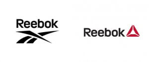
Reebok
Reebok decided to give its old logo (left) a bit of a facelift after 30 years of the same design – by adding a splash of red (right). The idea behind the smart new design was to encourage ordinary folk to do sport. To quote Reebok’s Chief Marketing Officer Matt O’Toole – It’s an invitation for all of us to take part and fight against complacency for everyday people not just super stars and elite athletes.
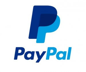
PayPal
PayPal decided to unveil a new logo and brand identity, with its refreshed branding featuring four key elements including a refreshed colour palette, a new dynamic angle graphic, a new wordmark in Futura (i.e. a new typeface) and a new version of the double-P monogram. The two latter elements locked together for PayPal’s new signature.
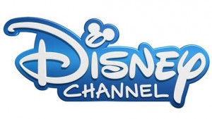
Disney Channel
Disney Channel also rolled out a new logo design in 2014 across all its international TV networks. It had previously favoured multiple colours and bold graphical elements, but the redesign was a more typographic logo where lettering comes to the fore and Mickey Mouse silhouette that had been prominent in its old logo became a subtle squiggle.
New logo
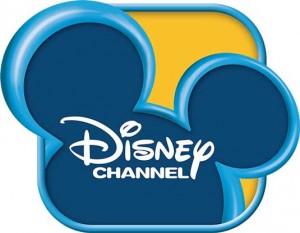
Old logo
Intel
With a logo that was proving slightly difficult to read on mobile devices, Intel cleverly decided on a subtle logo redesign that involved creating their very own font – Intel Clear – designed to be easier to read on screens and which can be used across different alphabets.
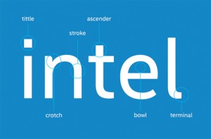
New logo
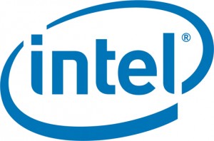
Old logo
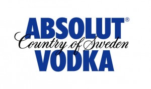
Absolut Vodka
A logo redesign that was more subtle than others was the update of the Absolut Vodka logo. The old logo had emphasised the Country of Sweden and Vodka elements where as last year’s redesign saw a new logo that simply reads Absolut followed by a full stop.
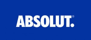
New logo
Old logo
For a great logo design that gets your brand and business noticed, speak to the team at your local Kwik Kopy today.
Image source: creativebloq.com