Think about a movie that you’ve being dying to see. Say, it’s the final instalment of a blockbuster film. Now think about walking through the cinema halls only to spot a life size, glossy and colourful version of the latest movie. What do you do? Turn to your friend of course and say, “I can’t wait to see that movie! It looks soooo good”. That’s what a well designed poster should do! Entice you to want more and ultimately buy a ticket to see the movie.
Then, there are some movie posters that have stood the test of time, becoming just as iconic as the film itself. In this blog we take a look back at the top 10 movie posters of all time and provide insight into the design elements, which define the poster.
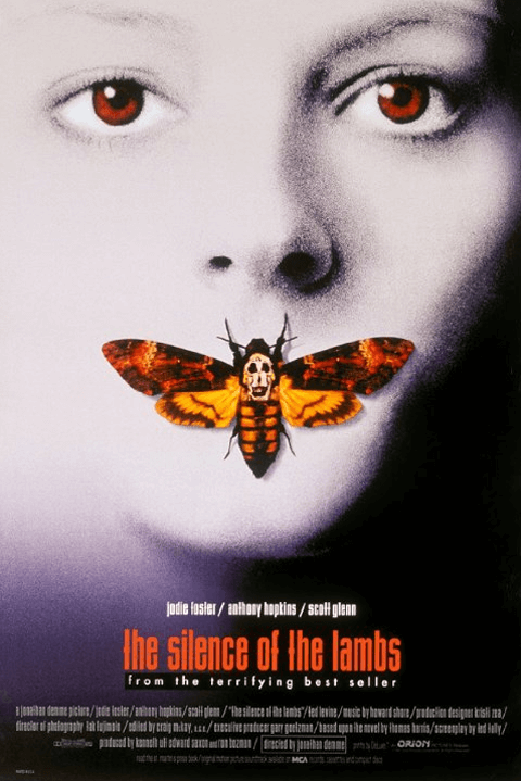
1. The Silence of the Lambs (1991)
An FBI agent interrogates an imprisoned psychiatrist, about a murderous former patient. The agent describes a traumatic experience, in exchange for information. This poster effectively conveys visual clues about the movie and evokes a sense of fear and terror. The skull on the moth is actually made out of naked women’s bodies and was influenced by a photograph entitled In Voluptas Mors by Phillippe. There is very little text on the poster and the images are overlaid to create a strong focal point at the centre of the design. Most notably, the focal point is of the moth silencing the woman.
Kwik Tip: Layering images on top of one another can help establish a strong focal point.

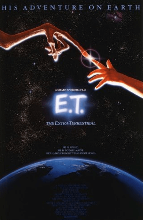
2. E.T. The Extra-Terrestrial (1982)
An alien, stranded on earth, forms a special bond with a young boy. They must hatch a plan to return E.T. to his home planet while evading a government task force. Blank space can be used in your design to make specific elements stand out. This dark, starry background highlights the arms of E.T. and the boy and the connection they shared despite being from different planets. The twinkle where their fingertips meet emphasises the extraordinary connection between the characters.
Kwik Tip: Use large expanses of blank space to make specific elements stand out.
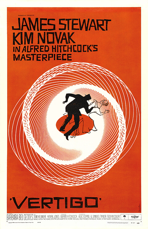
3. Vertigo (1958)
A retired detective follows a friend’s wife, to determine where she disappears to daily, as she doesn’t remember. His efforts are increasingly hindered by vertigo. This illustration alludes to his sensation of falling. A dizzying sense of movement is achieved by repeating concentric lines. The woman is only represented by an outline, suggesting she is liable to disappear. In contrast, the detective is depicted as a black shadow.
Kwik Tip: Use concentric lines to depict movement in print.
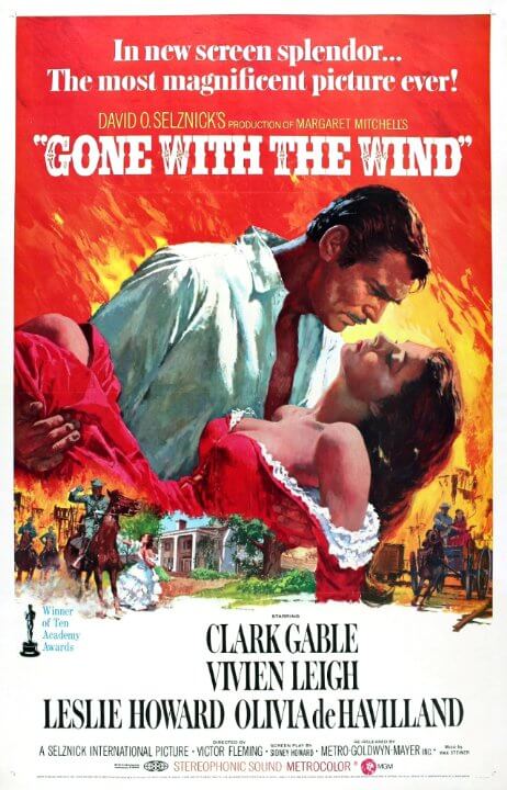
4. Gone with the Wind (1939)
A blockade runner falls in love with a southern belle during civil war. From riches to rags and multiple marriages, Scarlett’s epiphany may come too late. The substantial use of red colouring reflects the protagonist’s name. The fiery background hints at flaming scenes in the movie, Scarlett’s blazing temper, her heated relationship with Rhett and his burning desire. Increasing the scale of the lead characters forms a dominant, hero image.
Kwik Tip: Bold colours capture the viewer’s attention and can be used to evoke emotions.
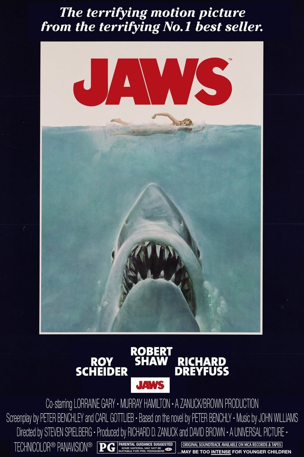
5. Jaws (1975)
A great white shark begins attacking Amity beach goers. The mayor is eager to sweep the matter under the sand dunes, to keep tourism booming. A sheriff, fisherman and scientist are forced to deal with the problem. This cross section of above and below the waterline depicts the shark baring its teeth, pointing towards the unsuspecting swimmer. The large shark in light blue tones is balanced by the small, red title text because the colour appears heavier.
Kwik Tip: A large, light shape can be balanced by a corresponding small, dark shape.
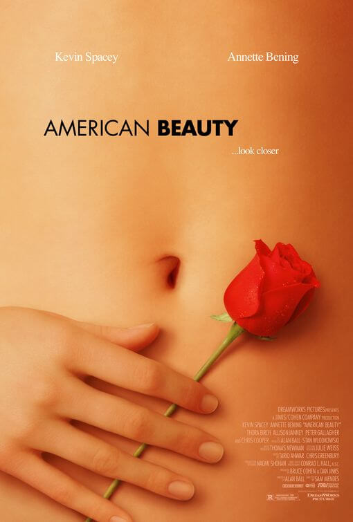
6. American Beauty (1999)
A father experiencing a midlife crisis fantasises about a schoolgirl surrounded by red rose petals. This poster is a perfect example of visual texture. The background consists entirely of an image of beautiful skin, demonstrating it’s youthful, soft, supple textural qualities. The fact that the female’s stomach is bare subtly implies nudity. As a result the poster refers to the film’s sensitive themes of sexual frustration and beauty without being vulgar.
Kwik Tip: Don’t underestimate the power of visual texture and subtle sophistication.
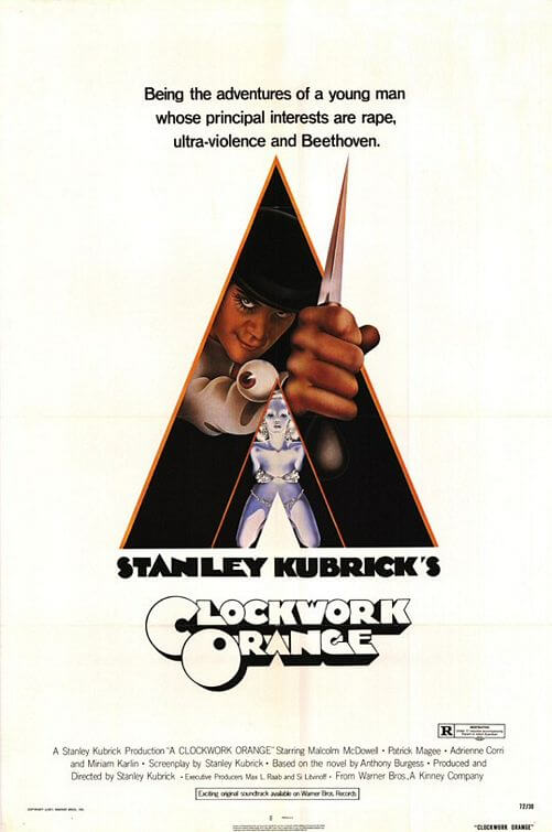
7. A Clockwork Orange (1971)
Alex enjoys participating in violence, so he undergoes experimental therapy in prison. The treatment makes him sick at the sight of violence preventing him from engaging in self-defence. The text and visual information are combined in this design. The triangular shape of the ‘A’ has been enlarged to encompass Alex, however, his hand is not contained within the triangle. Instead, his emerging fist creates a sense of depth, which reveals the transition from his shadowy past.
Kwik Tip: The text and images in your design should work together, to communicate the same message.
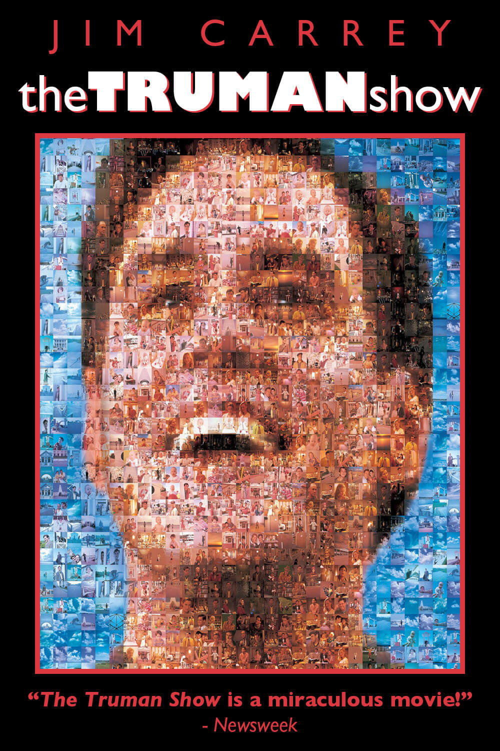
8. The Truman Show (1998)
Truman’s entire life is filmed for a live TV show. He eventually realises, after a series of strange events that he is surrounded by actors and lives on an enclosed set. The tessellated squares on this poster are photos of Truman’s world. When combined, these small images form a large-scale portrait of Truman. Such extensive repetition communicates his mundane daily routine and reinforces that each moment of his life is caught on camera.
Kwik Tip: Use large format to your advantage, by repeating your main message, with slight variation to add interest.
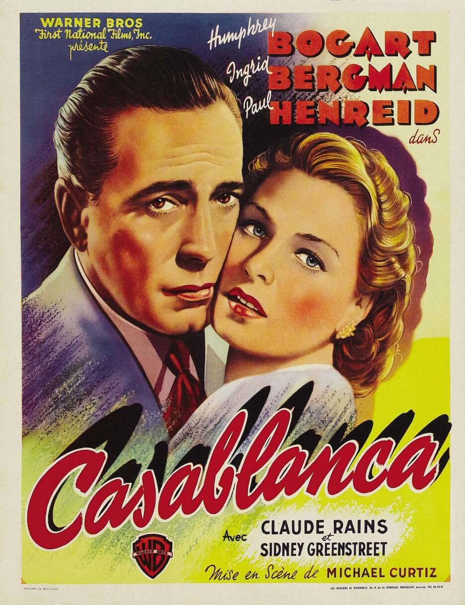
9. Casablanca (1942)
Nazis, refugees and resistance fighters alike pass through Casablanca, where Rick’s nightclub caters to a variety of corrupt clientele. He has the power to help a past lover and her husband escape to America, however Rick’s bitter feelings may get in the way. The text changes in font, size, colour and orientation. This establishes a hierarchy of textual information. The large title with a drop shadow captures your attention first, followed by the actors’ names.
Kwik Tip: Use different text sizes to highlight information in order of importance.
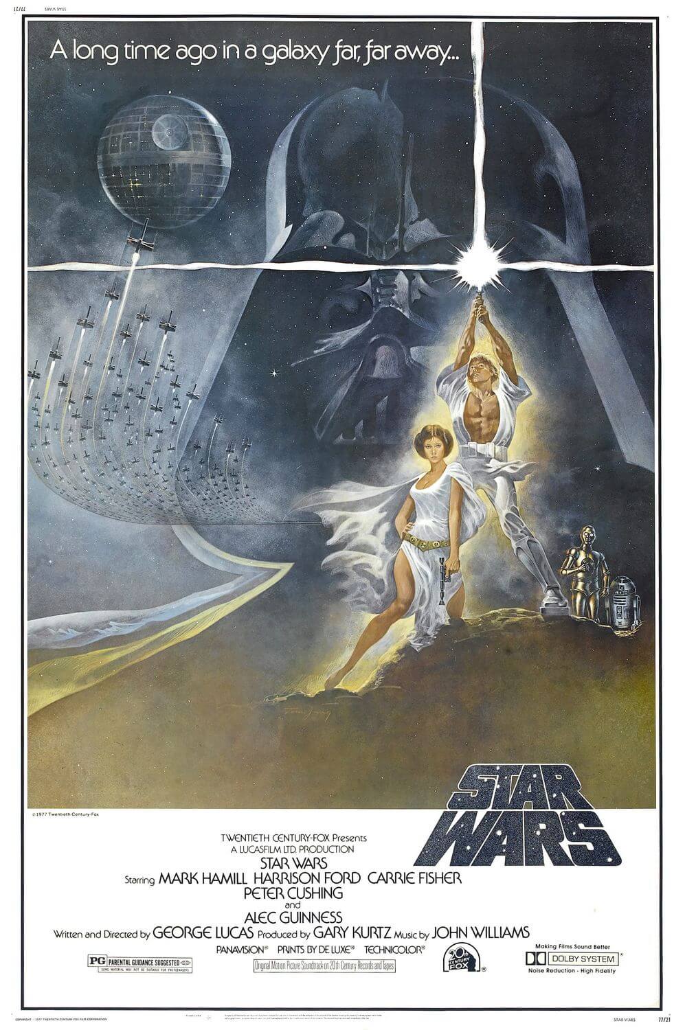
10. Star Wars (1977)
When Luke and Hans rescue Leia, they become entangled in a race to destroy Darth Vader’s Death Star. This poster demonstrates contrasts in size, colour, tone and direction. Darth Vader’s mask is enlarged when compared to the figures of the other characters. The cool, dark tones of the mask conflicts with the warm, bright, gold that surrounds Luke and Leia. The path of the spaceships curve in the opposite direction to the outline of Vader’s cloak.
Kwik Tip: Use contrasting shapes, colours and directional lines to indicate conflict.
Evidently, these posters successfully inform the viewer about the movie, using simple design techniques that you can try.