
When designing your business website, the website footer may not immediately spring to mind as a priority. But whilst it may not be the place you’re expecting the most impressive design or content, it is an important location that should not be neglected.
You see often site visitors will seek out your footer so it’s important to include the right information, design elements and usability. Here are some design tips and examples to help you make the most of your website footer.
5 Tips for Designing A Great Website Footer
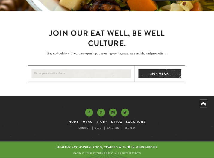
1. Keep the Design Simple
As with all design, simplicity is key and important when working with lots of information, such as your footer. Follow design rules such as plenty of space, clean elements and organise with purpose. The site below shows great use of colour, icons and text in the footer but is simple and has great flow. All the links are easy to click and the subtle detail of the image in the green box works well too.
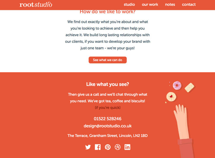
2. Include Contact Information
It’s always a nice touch to include relevant contact information in your footer, such as your phone number, email address and location (although remember to link to a full Contact Us page on your site as well). The site below is a great example of an impactful design, ideal when you want site visitors to contact you for projects and work.
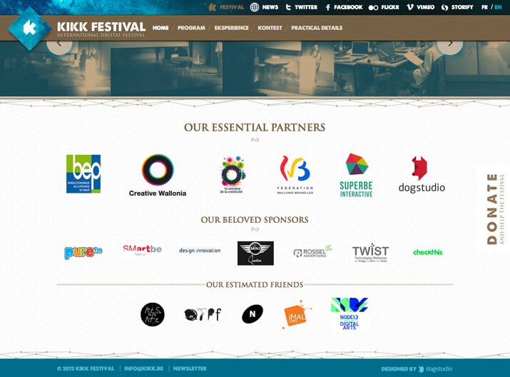
3. Use Graphic Elements
There are plenty of footers out there that just include a block of type, so adding logos or graphic elements can be point of difference. But remember, visual interest is great but be careful not to overload the small footer space with too many elements. Icons can work well in your footer for relevant links and the site below cleverly uses footer space to display partners using just logos and quick contact information.
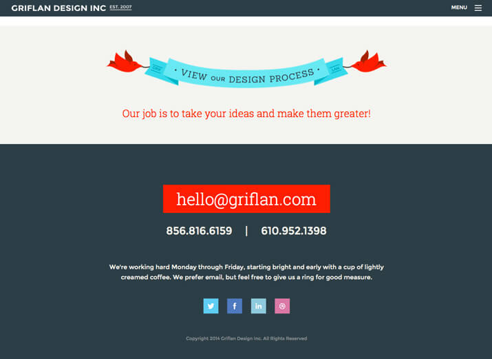
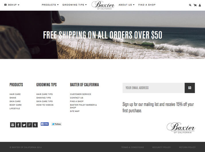
4. Create a Sense of Hierarchy
Your footer is located at the bottom of your web page as part of the overall site hierarchy. The footer itself, should also include a hierarchy of the elements it contains. The most important things get prominence (contact info, call to action or site map) – with standard information (such as your copyright notice) often the smallest in scale. In the example below, the company uses their footer to tell people what to do in order of how they want it done e.g. email them first, call them if email doesn’t work and if neither option is viable, then visit their social media sites.
5. Don’t Underline Links
There is no room in today’s site designs for links to have underlines. This is a dated technique and one of the biggest footer mistakes out there. As per the example below, your website footer can still include lots of links but without the underline you achieve an uncluttered, clean and attractive design.
Your footer can say a lot about your website, so for help getting it just right, speak to the web and digital team at your local Kwik Kopy today.
Image source: Design Shack