 RGB, CMYK and PMS are acronyms you see everywhere – and that can be confusing at times. Especially if you’re talking to an expert who doesn’t quite understand that you’re new to the industry and/or may not be up to speed with the terminology.
Here at Kwik Kopy, we like to keep it a jargon-free zone when we speak to our customers, so in this post we uncover some of the mystery related to colour.
RGB vs. CMYK vs. PMS
The terms RGB, CMYK and PMS refer to colour and if you want your marketing designs to look exactly the way you intend them to, it’s important that you understand the differences between each colour mode.
RGB – Red, Green, Blue
RGB is the colour mode that you will encounter in digital design. RGB is associated with all the screened devices you use on a daily basis – like your television, computer monitor, laptop, mobile devices, even your digital camera. Any image that is created for a computer screen will be in RGB mode and any image that will be eventually printed out will need to be converted to another format before it can be printed.
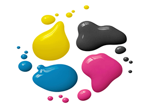
CMYK – Cyan, Magenta, Yellow, Key (Black)
Sometimes called ‘four-colour process printing’ the CMYK colour mode is used on almost all printed materials. Brochures, magazines, posters, flyers – all CMYK. CMYK inks are mixed during the printing process and layers of different inks are laid down in various quantities to make each colour.
PMS – Pantone Matching System
The Pantone Matching System is a universal colour matching system that is used by printers and designers the world over. Professionals use the PMS system because Pantone colours are very precise, which means you can talk to a designer on the other side of the world about a particular colour (i.e. PMS 382) and know for certain that you are both thinking of the exact same shade of lime green.
To speak to someone about print marketing materials for your business, speak to the team at your local Kwik Kopy today.